


 雷达卡
雷达卡


Ebola is presently an example of "small data" (let's hope it stays this way), but its data has many problems which lend themselves to useful lessons that can be applied to Big Data as well.
I have extracted the data for the 3 most affected countries (Guinea, Liberia, and Sierra Leone) from
- WHO (World Health Organization), www.who.int/csr/disease/ebola/situation-reports/en/ (Data after Aug 29, 2014)
- and CDC www.cdc.gov/vhf/ebola/outbreaks/2014-west-africa/index.html (before Aug 29, 2014)
The first lesson is to examine the data closely, since the report date is usually a few days later than "data" date, and the dates for each country sometimes differ. Thus we have to keep a separate date for each country data. Next figure shows the growth in the number of reported cases.

Fig 1. Total Number of Ebola Cases in West Africa, as of Oct 14, 2014
First observation we can make is that the growth in the number of reported cases in Liberia - the most affected country - has slowed down since the middle of September.
Is it because the epidemic has slowed down or because the cases are not being reported by overwhelmed local health officials? If the epidemic has slowed down, we can expect the slow down in number of deaths as well.
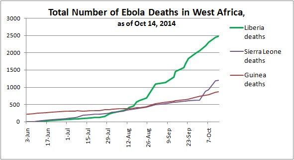
Fig 2. Total Number of Ebola Deaths in West Africa, as of Oct 14, 2014
The grim figure 2 of the number of death does not show any slowdown in Liberia but shows a significant jump in Sierra Leone deaths, starting in late Sept.
LiberiaNext, we examine Liberia in more details and look at the reported number of cases/day and number of deaths/day there.
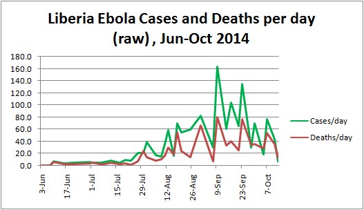
Fig 3. Liberia Ebola Cases and Deaths per day (reported), Jun-Oct 2014.
The raw data is very noisy, since the reports come at different intervals. Next idea is to "smooth" the data by examining changes at regular intervals, and weekly intervals is the next logical choice.
Since we see changing trends, having one global estimator will not work, even if we can fit a polynomial function to the total number of cases with R=0.987.
Instead, we will take the simplest approach and use local interpolation.
There is actual data for Liberia for Oct 7, Sep 30, and Sep 23 (all Tuesdays), but not for Sep 16. There is data for Sep 17 and Sep 9, so we can use these 2 points to estimate data for Sep 16. Since the number of cases appears to grow exponentially, we will not use linear extrapolation.
Instead we will take logarithms (which do look piecewise linear) and do a linear interpolation of logarithms. For example, to get the estimate for the log of cases for DateB between Date 1 and Date 2, we use
log (Cases (DateB)) = ( log(Cases(Date1)) - log(Cases(Date2)) ) * (DateB - Date2) /
(Date1 - Date2)
and then convert the log to the number of cases.
The following chart confirms that the estimated cases fit very nicely into the overall pattern.

Fig 4. Liberia Ebola reported and estimated Cases using log-linear approach, Jun-Oct 2014.
The Data Science Lesson here is the extra effort to estimate missing values is justified, if it results in a simpler model.
Now we can look at the data at weekly intervals, which are indicated on the X axis of Fig 4.
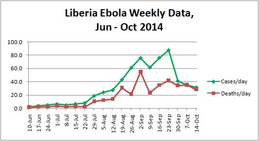
Fig 5. Liberia Ebola Weekly Data (reported and estimated), Jun - Oct 2014
The number of cases/day declines sharply, but the number of deaths does not decline correspondingly. Since cases are more likely to be underreported than deaths, the more likely conclusion is that the number of cases is very much under-reported.
So the data science lesson here is to remember that data is only an approximation of the real world, and try to understand the process of data collection and measurement.
Sierra LeoneWe can also do a similar analysis for Sierra Leone for July - October (in June the number of cases there was not reported reliably).
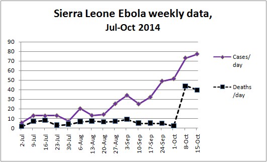
Fig 6. Sierra Leone Ebola Weekly Data (reported and estimated), July - Oct 2014.
We note a continued growth in cases/day since Sep 10 and a sharp jump deaths/day in early October - perhaps sharpness of the jump is due to late reporting.
Death RateNext, we examine what is the Ebola death rate.
It was reported that the Ebola death rate has risen to 70%, but no supporting data was provided.
The death rate in some analyses I saw compared the number of cases diagnosed on day X with number of deaths reported on the same day. This, however, is incorrect, since it takes Ebola a number of days to kill its victims.
Wikipedia says death from Ebola usually occurs within 7 to 16 days. Thomas Eric Duncan, first Ebola patient diagnosed in the US, succumbed to Ebola in about 13 days after his first hospital visit. The treatment for Ebola victims in West Africa is certainly less advanced than what he received, so a reasonable range for death from Ebola is about 1-2 weeks from diagnosis.
So we can compute death rate with 1 week delay, by dividing death(date=X) with cases(date=X + 1 week), etc.
Next chart looks at Ebola death rate in Liberia with same day (under-estimate), 1 week, and 2 week delays. The chart does not show data before July 8, when there were less than 110 reported cases, which produced both 1 and 2-week death rates higher than 100% - suggesting significant undercount of initial cases.
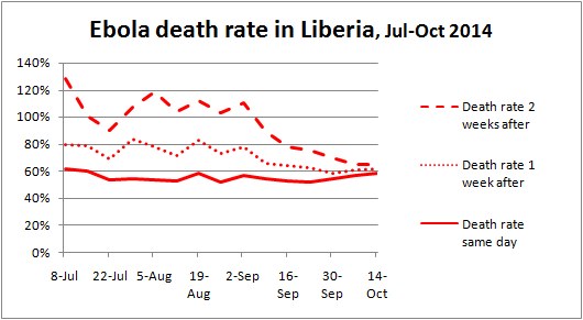
Fig 7. Liberia Ebola Death rate, same day, 1-week, and 2-weeks delay, July - Oct 2014
We see that with more cases, death rate converges to around 60-65%, with delay between 1 and 2 weeks.
Here is a similar chart for Sierra Leone death rate.

Fig 8. Sierra Leone Ebola Death rate, same day, 1-week, and 2-weeks delay, July - Oct 2014
In Sierra Leone there is a consistent gap between the same day, 1-week, and 2-week death rates, which suggests more consistent reporting than in Liberia. All 3 death rates decline from July up to Oct 1, then increase in the last 2 weeks. Sierra Leone death rate is lower, which suggests better treatment or more under-reporting.
What can we infer about spread of Ebola from this data?
Not much, since we have not used additional sources of data, such as geo-location.
The Oct 15, 2014 report from WHO has a very good chart showing the latest geographic spread of Ebola by counties - see below.
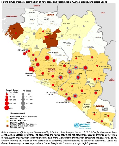
Fig 9. Geographical distribution of new cases and total cases in Guinea, Liberia, and Sierra Leone, as of Oct 12, 2014.
We can see where the disease grows faster.
Other analysis was done using air traffic data to predict Ebola spread via airline travel - see below.

Fig 10. Air traffic data to predict the Ebola spread
Data Science Lesson: Bring as many additional data sources as you can to get a better understanding of the problem.
What do you think about Ebola analysis and Data Science lessons?
Let me know in the comments below.
 提升卡
提升卡 置顶卡
置顶卡 沉默卡
沉默卡 变色卡
变色卡 抢沙发
抢沙发 千斤顶
千斤顶 显身卡
显身卡


 京公网安备 11010802022788号


