When producing so called infographics, it is rather common to use images rather than a mere grid as background. In this blog post, I will show how to use a background image with ggplot2.
Packages requiredThe following code will install load and / or install the R packages required for this blog post.
- if (!require("pacman")) install.packages("pacman")
- pacman::p_load(jpeg, png, ggplot2, grid, neuropsychology)
Choosing the data
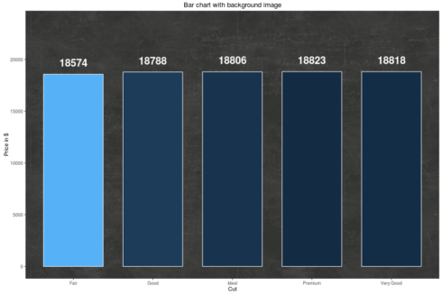
The data set I will be using in this blog post is named diamonds and part of the ggplot2 package. It contains information about – surprise, surprise – diamonds, e.g. price and cut (Fair, Good, Very Good, Premium, Ideal). Using the tapply-function, we create a table returning the maximum prices per cut. Since we need the data to be organized in a data frame, we must transform the table using the data.frame-function.
- mydata <- data.frame(price = tapply(diamonds$price, diamonds$cut, max))
- mydata$cut <- rownames(mydata)
cutprice
Fair18574
Good18788
Very Good18818
Premium18823
Ideal18806Importing the background image
The file format of the background image we will be using in this blog post is JPG. Since the image imitates a blackboard, we name it “blackboard.jpg”. The image file must be imported using the readJPEG-function of the jpeg package. The imported image will be saved into an object named image.
- imgage <- jpeg::readJPEG("blackboard.jpg")
To import other image file formats, different packages and functions must be used. The next code snippet shows how to import PNG images.
- image <- png::readPNG("blackboard.png")
Drawing the plot
In the next step, we actually draw a bar chart with a backgriund image. To make blackboard.jpg the background image, we need to combine the annotation_custom-function of the ggplot2 package and the rasterGrob-function of the grid package.
- ggplot(mydata, aes(cut, price, fill = -price)) +
- ggtitle("Bar chart with background image") +
- scale_fill_continuous(guide = FALSE) +
- annotation_custom(rasterGrob(imgage,
- width = unit(1,"npc"),
- height = unit(1,"npc")),
- -Inf, Inf, -Inf, Inf) +
- geom_bar(stat="identity", position = "dodge", width = .75, colour = 'white') +
- scale_y_continuous('Price in
- [backcolor=rgb(34, 34, 34)][color=rgb(41, 107, 204)][url=http://datascienceplus.com/wp-content/uploads/2016/10/plot-background2.png][color=rgb(255, 255, 255) !important][/color][/url][/color][/backcolor]
- [color=rgb(41, 107, 204)][url=http://datascienceplus.com/wp-content/uploads/2016/10/plot-background2.png][img=0,327]http://datascienceplus.com/wp-content/uploads/2016/10/plot-background2-490x327.png[/img][/url][/color]
- [b]Adding opacity[/b][align=left][color=#383838][font=Arial, Helvetica, sans-serif]Using the specification alpha = 0.5, we add 50% opacity to the bars. alpha ranges between 0 and 1, with higher values indicating greater opacity.[/font][/color][/align] [code]ggplot(mydata, aes(cut, price, fill = -price)) +
- theme_neuropsychology() +
- ggtitle("Bar chart with background image") +
- scale_fill_continuous(guide = FALSE) +
- annotation_custom(rasterGrob(imgage,
- width = unit(1,"npc"),
- height = unit(1,"npc")),
- -Inf, Inf, -Inf, Inf) +
- geom_bar(stat="identity", position = "dodge", width = .75, colour = 'white', alpha = 0.5) +
- scale_y_continuous('Price in
- [backcolor=rgb(34, 34, 34)][color=rgb(41, 107, 204)][url=http://datascienceplus.com/wp-content/uploads/2016/10/plot-background.png][color=rgb(255, 255, 255) !important][/color][/url][/color][/backcolor]
- [color=rgb(41, 107, 204)][url=http://datascienceplus.com/wp-content/uploads/2016/10/plot-background.png][img=0,327]http://datascienceplus.com/wp-content/uploads/2016/10/plot-background-490x327.png[/img][/url][/color]
- [align=left][color=#383838][font=Arial, Helvetica, sans-serif]The recently published R package neuropsychology contains a theme named theme_neuropsychology(). This theme may be used to get bigger axis titles as well as bigger axis and legend text.[/font][/color][/align][align=left][color=#383838][font=Arial, Helvetica, sans-serif]I hope you find this post useful and If you have any question please post a comment below. You are welcome to visit my personal blog [color=rgb(41, 107, 204)][url=https://scriptsandstatistics.wordpress.com/]Scripts and Statistics[/url][/color] for more R tutorials.[/font][/color][/align]
- , limits = c(0, max(mydata$price) + max(mydata$price) / 4)) +
- scale_x_discrete('Cut') +
- geom_text(aes(label = round(price), ymax = 0), size = 7, fontface = 2,
- colour = 'white', hjust = 0.5, vjust = -1)
[color=rgb(255, 255, 255) !important]
Adding opacity
Using the specification alpha = 0.5, we add 50% opacity to the bars. alpha ranges between 0 and 1, with higher values indicating greater opacity.
[ DISCUZ_CODE_7 ][color=rgb(255, 255, 255) !important]
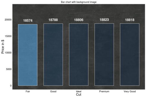
The recently published R package neuropsychology contains a theme named theme_neuropsychology(). This theme may be used to get bigger axis titles as well as bigger axis and legend text.
I hope you find this post useful and If you have any question please post a comment below. You are welcome to visit my personal blog Scripts and Statistics for more R tutorials.
, limits = c(0, max(mydata$price) + max(mydata$price) / 4)) +
scale_x_discrete('Cut') +
geom_text(aes(label = round(price), ymax = 0), size = 7, fontface = 2,
colour = 'white', hjust = 0.5, vjust = -1) [/code]
[color=rgb(255, 255, 255) !important]

Adding opacity
Using the specification alpha = 0.5, we add 50% opacity to the bars. alpha ranges between 0 and 1, with higher values indicating greater opacity.
[ DISCUZ_CODE_7 ][color=rgb(255, 255, 255) !important]

The recently published R package neuropsychology contains a theme named theme_neuropsychology(). This theme may be used to get bigger axis titles as well as bigger axis and legend text.
I hope you find this post useful and If you have any question please post a comment below. You are welcome to visit my personal blog Scripts and Statistics for more R tutorials.



 雷达卡
雷达卡



 京公网安备 11010802022788号

