Chinese Growth - Real Or Imagined? Submitted by Tyler Durden on 05/05/2013 16:15 -0400 China Hong Kong We toyed with titling this post "Lies, Damned Lies, And Chinese Statistics" but perhaps that is a little harsh, though one glance at the chart below and one instantly comprehends the efforts that are being undertaken to 'show' the world that China's transition is on target (and crumbling into collapse). As we recently noted , it is actually unlikely that China can complete this transition to organic (as opposed to investment-led) growth (with moderate growth the exception not the rule) , and China's recent trade data does not pass the smell test . As GREED Fear's Chris Wood notes, with the Hong Kong trade data being released last week, it is worth noting a growing discrepancy between the data on China’s exports to Hong Kong reported by mainland’s customs department and the corresponding data on Hong Kong’s imports from China reported by Hong Kong’s Census and Statistics Department in March. Such inconsistency in China’s export numbers relative to the imports data from its trading partners has generated growing speculation about the credibility of China’s trade figures . Various explanations have been put forward (below) but the divergence would seem far too large to be simply explained by "different statistical methods" as the Chinese government's official line notes. Via GREED Fear, ... Hong Kong’s reported imports from China rose by “only” 13.8%YoY to US$20.6bn in March and were up 10%YoY to US$56bn in 1Q13. By contrast, China reported that exports to Hong Kong surged by 93%YoY to US$48.4bn in March and were up 74%YoY to US$106bn in 1Q13. As a result, the ratio between China’s reported exports to Hong Kong and Hong Kong’s reported imports from China has surged to 2.35 times in March, up from 1.36x in 2012 and an average of 1.11x during the previous five years between 2007 and 2011. Such inconsistency in China’s export numbers relative to the imports data from its trading partners has generated growing speculation about the credibility of China’s trade figures. One suggestion, as noted by CLSA’s head of economic research Eric Fishwick, is that Chinese companies have been inflating their shipment data to take advantage of the government’s export tax rebates . Another explanation GREED fear has heard recently is that Chinese companies are over-invoicing their exports to evade capital controls to bring in money from abroad. GREED fear for now has no idea about the exact cause of such a huge discrepancy . But it is a point to be aware of. The divergence would seem too large to be simply explained by “different statistical methods” , as argued by the mainland’s General Administration of Customs spokesman, Zheng Yuesheng. Source: GREED Fear Average:
Gold-Silver Ratio In Phase Space Submitted by Tyler Durden on 04/28/2013 23:04 -0400 European Central Bank Guest Post Precious Metals Submitted by The World Complex Gold-Silver Ratio In Phase Space The reconstructed phase space portrait is one tool that can be used to gain insight into the dynamics of complex systems, whether these systems be natural or man-made. Today we will use these tools to look at precious metals. The near-constant slope over long stretches of this plot tells us that gold is already increasing in price exponentially. So don't say that gold price will increase exponentially during a financial crisis. It is already doing so, and has been since early 2001 (notwithstanding the recent turmoil). The break in slope in late 2005 tells us that the gold price suddenly began to increase more rapidly. I don't know if anything unusual happened in late 2005, but there was a bland warning by the ECB issued in December 2005 about growing global financial imbalances . Reconstructing phase space portraits normally requires two or more time series, sampled at equivalent intervals. You can simply plot one series against the other (a scatter plot). If you are using excel or a similar program, this is remarkably easy. Looks impressive--the gold line represents a gold:silver ratio of about 60. Deviations from that line represent deviations in this ratio. Silver's rise to nearly $50 in 2011 causes the funny looking nose on the graph at upper right. The curve represents the time evolution of the system, which moved in herky-jerky fashion from the lower left (in January 2000) towards the upper right of the graph (a little while ago). Each plotted point represents the state at the end of each month until roughly the present. For graphs covering at least an order of magnitude, it may be worth using logarithmic axes. The problem with these graphs is the presence of the US dollar. Most of the action in the plot is due to the declining value of the US dollar. To remove it, let us consider only the gold:silver ratio itself. There are a number of long-accepted methods for projecting a single data series into a state space of more than one dimension. The intuitively obvious approach is to plot the data against its first (and higher, if desired) time derivatives. The approach I have used most commonly in these pages is a time delay plot , in which the respective observations are plotted against another, older observation. The lag is the number of time steps between the two observations, and there are prescribed methods for establishing an ideal lag . Taking the month-end ratio of the gold price to the silver price, plotting it against a lagged copy of itself ( delayed by one year ), we see the following. We are presently near where we started (just before the last financial crisis, and currently following a trajectory similar to that which we followed in the summer of 2008 (the yellow dot represents where we would be if April ends at today's prices). Given what we've recently experienced in the metals markets and stocks, it is extremely worrisome to consider we are only at the equivalent of mid-summer 2008! There is more to the story--plotting phase space in only two dimensions can be a little risky because the third dimension may convey a lot of information. To create the third dimension, we apply a second lag equal to the first--so that the third axis represents an observation two lag periods behind the observation plotted on the first axis. In the above graph, the red curve represents the 2-d projection shown above plotted on a reference plane (z=55)--and the green curve represents the 3-dimensional phase space portrait shown relative to the reference. Where there are green dashed lines between the 3-d and 2-d plots, the 3-d plot is above the reference plane, and where there are red dashed lines, the 3-d plot lies below the reference plane. In the 3-d plot, we see that the current trajectory (near the bottom of the graph) is quite a bit below the trajectory during the crisis of 2008. It may be that the 2008 financial crisis was one of financial institution solvency, whereas our current crisis is starting to look like one of financial system failure. If this is the explanation for the differing trajectories then my projection is that we are going to see something we haven't seen before. The gold-silver ratio has the potential to rise to heights never before seen. The reason is that major crises encourage hoarding and flight; and it is much easier to flee with a million dollars in gold than a million dollars in silver. Average: 3.636365 Your rating: None Average: 3.6 ( 11 votes)
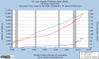
Physical Gold vs. Paper Gold: The Ultimate Disconnect Submitted by Tyler Durden on 04/23/2013 21:29 -0400 Central Banks China Commitment of Traders ETC Exchange Traded Fund Futures market George Soros Goldman Sachs goldman sachs Gross Domestic Product Guest Post LIBOR MF Global Peter Schiff Precious Metals Purchasing Power Sovereign Debt Submitted by Bud Conrad of Casey Research , How can we explain gold dropping into the $1,300 level in less than a week? Here are some of the factors: George Soros cut his fund holdings in the biggest gold ETF by 55% in the fourth quarter of 2012. He was not alone: the gold holdings of GLD have contracted all year, down about 12.2% at present. On April 9, the FOMC minutes were leaked a day early and revealed that some members were discussing slowing the Fed $85 billion per month buying of Treasuries and MBS. If the money stimulus might not last as long as thought before, the "printing" may not cause as much dollar debasement. On April 10, Goldman Sachs warned that gold could go lower and lowered its target price. It even recommended getting out of gold. COT Reports showed a decrease in the bullishness of large speculators this year (much more on this technical point below). The lackluster price movement since September 2011 fatigued some speculators and trend followers. Cyprus was rumored to need to sell some 400 million euros' worth of its gold to cover its bank bailouts. While small at only about 350,000 ounces, there was a fear that other weak European countries with too much debt and sizable gold holdings could be forced into the same action. Cyprus officials have denied the sale, so the question is still in debate, even though the market has already moved. Doug Casey believes that if weak European countries were forced to sell, the gold would mostly be absorbed by China and other sovereign Asian buyers, rather than flood the physical markets. My opinion, looking at the list of items above, is that they are not big enough by themselves to have created such a large disruption in the gold market. The Paper Gold Market The paper gold market is best embodied in the futures exchanges. The prices we see quoted all day long moving up and down are taken from the latest trades of futures contracts. The CME (the old Chicago Mercantile Exchange) has a large flow of orders and provides the public with an indication of the price of gold. The futures markets are special because very little physical commodity is exchanged; most of the trading is between buyers taking long positions against sellers taking short positions, with most contracts liquidated before final settlement and delivery. These contracts require very small amounts of margin – as little as 5% of the value of the commodity – to gain potentially large swings in the outcome of profit or loss. Thus, futures markets appear to be a speculator's paradise. But the statistics show just the opposite: 90% of traders lose their shirts. The other 10% take all the profits from the losers. More on this below. On April 13, there were big sell orders of 400 tonnes that moved the futures market lower. Once the futures market makes a big move like that, stops can be triggered, causing it to move even more on its own. It can become a panic, where markets react more to fear than fundamentals. Having traded in futures for over two decades, I want to provide some detail on how these leveraged markets operate. It's important to understand that the structure of the futures market allows brokers to sell positions if fluctuations cause customers to exceed their margin limits and they don't immediately deposit more money to restore their margins. When a position goes against a trader, brokers can demand that funds be deposited within 24 hours (or even sooner at the broker's discretion). If the funds don't appear, the broker can sell the position and liquidate the speculator's account. This structure can force prices to fall more than would be indicated by supply and demand fundamentals. When I first signed up to trade futures, I was appalled at the powers the broker wrote into the contract, which included them having the power to immediately liquidate my positions at their discretion. I was also surprised at how little screening they did to ensure that I was good for whatever positions I put in place, considering the high levels of leverage they allowed me. Let me tell you that I had many cases where I was told to put up more margin or lose my positions. Those times resulted in me selling at the worst level because the market had gone against me. The point of this is that once a market moves dramatically, there are usually stops taken out, positions liquidated, margin calls issued, and little guys like me get taken to the cleaners. Debates rage about the structure of the futures market, but my personal opinion is that a big hammer to the market by a well-heeled big player can force liquidations, increase losses, and push the momentum of the market much lower than the initial impetus would have. Thus, after a huge impact like we saw on April 13, the market will continue with enough momentum that a well-timed exit of a huge set of short positions can provide profits to the well-heeled market mover. Moving from theory to practice, one of the most important things to keep your eye on is the Commitment of Traders (COT) report, which is issued every Friday. It details the long and the short positions of three categories of traders. The first category is called "commercials." They are dealers in the physical precious metals – for example, gold miners. The second category is called "non-commercials." They include hedge funds and large commercial banks like JP Morgan. Non-commercials are sometimes called "large speculators." The rest are the small traders, called "non-reporting" since they are not required to identify themselves. The ones to watch are the large speculators (non-commercials), as they tend to move with the direction of the market. Individual entities could be long or short, but in combination the net position of the group is a key indicator. The following chart shows the price of gold as a blue line at the top, and the next panel down shows the net position of these large speculators as a black line. You can see that over the long term, they move together. When the net speculative position is above zero, this group is betting on rising gold prices. Of course, the reverse is true when it's below zero. In this 20-year view, the large speculators were holding net negative positions during the lowest point of the gold price, around the year 2000. As the price of gold rose, their positions went net long, and they profited. An interesting thing about the chart above is that the increasing amount of net longs reversed itself before gold peaked in 2011, suggesting that these large speculators became slightly less bullish all the way back in 2010. The balance remains net long, but it remains to be seen how long that lasts. What is not so obvious is that these large speculators are so big that they can affect the market as well as profit from it; when they initiate massive positions in a bull market, they drive the price of the futures contracts even higher. Similarly, when they remove their positions or actually go short, they can push the market lower. So what happened a week ago was that a massive order to sell 400 tons of gold all at once hit the market. Within minutes the price plummeted, and over a two-day period resulted in the largest drop of the price for futures delivery of gold in 33 years: down $200 per ounce. We don't have the name of the entity that did this. However, the way the gold was sold all at once suggests that the goal was not to get the best price. An investor with a position of this size should have been smart enough to use sensible trading tactics, issuing much smaller sell orders over a period of time. This would avoid swamping the market; and some of the orders would be filled at higher prices and thus generate more profit. Placing a sell order big enough to affect the overall market price suggests that someone with powerful backing wanted to drive the price of gold down. Such an entity could have been a large speculator who already had a sizable short position and could gain by unloading some of its short position once the market momentum had driven the price even yet lower. Or it could be a central bank – one that might be happy to have the gold price move lower, as it would provide cover for its printing of more new money. Of course, it could be some entity that owned long contracts and wanted to get out of the position all at once. We don't know, but this kind of activity, resulting in the biggest drop in 30 years, raises more than just suspicion when we consider how important the price of gold is to many markets around the globe. Can markets really be influenced by big players? Well, was the LIBOR rate accurately reported by huge banks? Have players ever tried to corner markets? The answer to all the above, unfortunately, is yes. There's an even bigger problem with the legal structure of the futures market: even the segregated funds on deposit can be pilfered by the broker for the brokerage's other obligations. That is what happened to MF Global customers under Mr. Corzine. (I had an account with a predecessor company called Man Financial – the "MF" in the name. I also had an account with Refco, which is now defunct. Fortunately, the daggers did not hit my account, since I was not a holder when the catastrophes occurred.) My take: the futures market is dangerous, and not a place for beginners. One last note: after the Bankruptcy Act of 2005, the regulations support the brokers, not the investors, when there are questions of legality about losses in individual investment accounts. Casey Research will be producing a report with much more detail on this subject in the near future. So, what now? We aren't going to see a secret memo – no smoking gun to confirm that what happened on April 13 was an attempt to affect the market. Still, the evidence is suspicious. When big entities can gain from putting on big positions, the incentives are big enough for them to try – LIBOR, Plunge Protection Team, Whale Trade, etc. , all support this view. The Physical Gold Market Previously, there was little difference between the physical and paper markets for gold. Yes, there were premiums and delivery charges, but everybody regarded the futures market as the base quote. I believe this is changing; people don't trust the paper market as they used to. Instead of capitulating to fear of greater losses, the demand for physical gold has hit new records. The US Mint sold a record 63,500 ounces – a whopping 2 tonnes – of gold on April 17 alone, bringing the total sales for the month to 147,000 ounces; that's more than the previous two months combined. Indian markets, which are more oriented to physical metal, now have a premium of US$150 over the futures price in Chicago. Demand at coin dealers has increased as the price has dropped. And premiums are much bigger than they were as recently as a week ago. Here is a vendor page that quotes purchase prices and calculates the premiums on an ongoing basis. It shows premiums of 50% and more in many cases. On eBay, prices for one-ounce silver coins are $33 to $35, where the futures price is quoted as $23. A look on Friday April 19 shows one vendor out of stock on most items: Buy - Sell On SilverBullion 2013 Sealed Mint Boxes Of 1 Oz. Silver American Eagles - Brand New Coins 500 Coin Min. (1 Sealed Box) Buy @ Spot + $1.80 Sold Out 2013 Sealed Mint Boxes Of 1 Oz. Silver American Eagles "San Francisco Mint" Brand New Coins 500 Coin Min. (1 Sealed Box) Buy @ Spot + $2.00 Sold Out 90% Silver Coin Bags (Our Choice Dimes Or Quarters) $1,000 Face Value Figured at 715 Ozs Per $1,000 Face $1,000 Face Value Min. We Buy @ Spot + $1.70 Per Oz (Spot + $1.70 X 715) Spot + $4.99 Per Oz (Spot + $4.99 X 715) 90% Silver Coin Bags 50 Half Dollars $1,000 Face Value We Ship in 2 $500 Face Bags $1,000 Face Value Min. We Buy @ Spot + $1.90 Per Oz (Spot + $1.90 X 715) Sold Out 90% Silver Coin Bags Walking Liberty Half Dollars $1,000 Face Value We Ship in 2 $500 Face Bags $1,000 Face Value Min. We Buy @ Spot + $2.10 Per Oz (Spot + $2.10 X 715) Sold Out Amark 1 Oz. Silver Rounds ( Made By Sunshine ) Pure .999 BU 500 Coin Min. Buy @ Spot -15c Sold Out Clearly, the physical gold market today is sending different signals than the paper market. The Case for Gold Is Still with Us The long-term fundamental reasons to hold gold are undeniably still with us. The central banks of the world are acting in concert in "currency wars" or "the race to debase." As they print more money, the purchasing power of each unit declines. They are caught between the rock of having to keep interest rates low to support their governments' huge deficits and the hard place of the long-term effect of diluting their currency. If rates rise, even First World governments will be forced to pay higher interest fees, leading to loss of confidence in their ability to pay back their debt, which will bring on a sovereign debt crisis like what we have seen in the PIIGS or Argentina recently. The following chart shows the rapid growth in the balance sheets as a ratio to GDP for the three largest central banks. I've extrapolated the expected growth into the future based on the rate at which they propose to buy up assets. One could argue about how long these growth rates will continue, but the incentives are all there for all central banks to bail out their governments and their commercial banks. I fully expect the printing game to continue to provide the fuel for hard-asset investments like gold and silver to increase in price in the years to come. Buying Opportunity or Time to Flee? So what does it all mean? The paper price of gold crashed to $1,325 in the wake of this huge trade. It is now hovering around $1,400. My first reaction is to suggest that this is only an aberration, and that the fundamentals of the depreciating value of paper currencies will eventually take the price of gold much higher, making it a buying opportunity. But what I can't predict is whether big players might again deliver short-term downturns to the market. The momentum in the futures market can make swings surprisingly larger than the fundamentals of currency valuation would suggest. Traders will be looking for a significant turnaround to the upside in price before entering long positions. However, a long-term, fundamentals-based trader has to look at the low price as a buying opportunity. I can't prove it, but I think the fundamentals will drive the long-term market more than these short-term events. The fight between pricing from the physical market for bullion and that from the "paper market" of futures is showing signs of discrimination and disagreement, as the physical market is booming, while prices set by futures are seemingly pressured to go nowhere. In short, I think this is a strong buying opportunity. What would you do if the government outlawed gold ownership? If you had taken the steps outlined in Internationalizing Your Assets, you'd have little to worry about, as much of your gold – indeed, most of your assets – would be protected. Internationalizing Your Assets is a must-see web video for anyone concerned about losing wealth to increasingly desperate politicians. The event premiers at 2 p.m. EDT on April 30 and features some of the world's foremost experts on international asset protection, including Casey Research Chairman Doug Casey and Euro Pacific Capital CEO Peter Schiff. Attending Internationalizing Your Assets is free. To register or for more information, please visit this web page .
Will LGIVs Be The 'Straw' To Break China's Credit-Fueled Growth 'Back'? Submitted by Tyler Durden on 11/23/2012 19:55 -0500 Barclays Bond China We presented a detailed look into China's credit bubble earlier this week and why serial-extrapolators may well have to adjust their strategy calls sooner rather than later; but the more we look around in the detritus of China's non-centrally-issued datasets, the more concerned we become. To wit, the major issuance of local government investment vehicles (LGIVs) in the last few months to stabilize growth amid falling fiscal revenue growth . The unintended consequence of PBoC-sponsored debt restructurings (as Barclays notes, rolling over debt via the issuance of new products or buyouts by asset management companies) is creating a false sense of security for these instruments, reinforcing the belief of an 'implicit government guarantee' . We tend to agree with Barclays when they conclude that the underestimation of the credit risks in both the trust loans and bond markets could induce excessive risk-taking - and warrants extremely close monitoring. Average: 4.714285 Your rating: None Average: 4.7 ( 7 votes) Tweet Login or register to post comments 3481 reads Printer-friendly version Send to friend Similar Articles You Might Enjoy: Frontrunning: October 10 Barclays Wins Euromoney's Best Global Debt, Best Investment Bank, And Best Global Flow House Of The Year Awards West vs East Banker Pay Comparison: JPM's Jamie Dimon: $23,000,000; ICBC's Jiang Jianqing: $308,000 Frontrunning: October 25 Faber: "Middle East Will Go Up In Flames" ... "Have To Be In Precious Metals And Equities"
Chart Of The Day: America's Geriatric Work F(a)rce Submitted by Tyler Durden on 11/02/2012 13:05 -0400 BLS Bureau of Labor Statistics Demographics The traditional excuse apologists for America's collapsing labor force participation rate use every month is that due to "demographics" and retiring baby boomers, increasingly more old workers are no longer counted by the BLS and as a result, are skewing the labor force. That's where they leave it because digging into details is not really anyone's forte anymore. This would be great if it was true. It isn't. A month ago in " 55 And Under? No Job For You " we presented visually and quite simply that of the 3.3 million jobs "created" (updated for October's data), a gasp-inducing 3.8 million has gone to workers aged 55 and over, or the one cohort that according to conventional wisdom is retiring, and actively leaving the workforce. How can America's elderly workers account for more than the total? Simple: workers in the young (16-19) and prime (25-54) cohorts have cumulatively lost a whopping 1.3 million, with just the 25-54 age group losing 842,000 jobs (don't believe us: spot check it right here courtesy of the Fed). In other words, America's edlerly are not only not in a rush to retire, they are reentering the workforce (thanks to the Chairman's genocidal savings policy which has just rendered the value of all future deposits worthless thanks to ZIRP), and in doing so preventing younger workers, in their prime years, from generating incremental jobs. And nowhere is this more visible than in today's jobs report. On the surface, the US generated a whopping 413,000 jobs (after generating a massive 873,000 last month) according to the Household Survey in October. That's great, unfortunately breaking down this cumulative addition by age cohort confirms precisely what we have said: all the jobs are going to old workers, who have zero wage bargaining leverage (as they just want to have a day to day paycheck). To wit: when broken down by age group, the total October increase shows that of the new jobs, 10.7% went to those aged 16-19 ( source ), 11.6% went to those aged 20-24 ( source ), a tiny 9.8% went to the prime agr group: 25-54 ( source ), and a massive 67.8% went to America's baby boomers: those aged 55 and over ( source ), and who refuse to leave the workforce and make way for others. Visually, this is as follows: But the most eye-opening chart is this one showing jobs in the 25-54 and 55 and over categories: And one wonders why America's labor force has no bargaining power, and why average hourly wages are imploding, and why nobody can afford anything anymore... Finally, all of the above excludes previous disclosures that the bulk of jobs created in the past 4 years is in the part-time job catergory. Average: 4.45 Your rating: None Average: 4.5 ( 20 votes) Tweet Login or register to post comments 10982 reads Printer-friendly version Send to friend Similar Articles You Might Enjoy: The Ever-Increasing Age Of Retirement $450 Billion In ZIRPorized Purchasing Power: Two Charts That Explain The Baby Boomer Dilemma America's Demographic Cliff: The Real Issue In The Coming, And All Future Presidential Elections Chart Of The Day: 55 And Under? No Job For You The New Retirement Normal: The Average American Must Work For Two Extra Years After Death
What Do High Yield Bonds Know That No One Else Does? Submitted by Tyler Durden on 10/26/2012 14:20 -0400 Barclays Bond CDS High Yield Wizened old market participants are often heard mumbling into their cups of green tea that "credit anticipates, and equity confirms" and so it is once again that the credit markets - fresh from the exuberance of endless technical flows, CLOs, and PIK-Toggles - has made a rather abrupt U-Turn in recent weeks. As Barclays points out, the ratio of High-Yield bond spreads to Investment-Grade bond spreads is its highest in three years as IG has been dragged lower by QEtc's impact on MBS and rotation up the spread spectrum. Typically, this kind of push would mean high-beta credit would outperform but far from it as cash bond markets have gapped out very recently. With call constraints (thanks to ZIRP) on high-yield bonds, the extreme price dislocation (given HY's inability to rally 'enough') will likely drag IG credit out - and that is a very crowded trade. Just one more unintended consequence from the Fed. HY bond spreads are pricing in considerably more pain than IG bond spreads - what do they know? CDS markets are not moving as much - having short-squeezed recently and just reracking with stocks. Bonds - real money accounts - are in trouble here...if this differential remains... but it seems that the crap-end of the credit quality spectrum remains active with new issuance. Average: 5 Your rating: None Average: 5 ( 4 votes) Tweet Login or register to post comments 9255 reads Printer-friendly version Send to friend Similar Articles You Might Enjoy: CDS Market Begins Trading Imaginary Credit With LIBOR-Style Fixings 8 Ways Of Looking At A High Yield Bond Selloff What Does High Yield Credit Know That Stocks Don't? Why The High-Yield Market Won't See A Performance-Chasing Rally Dow Closes At Highest Since 2007 As High Yield Outperforms
Taylor Swift Your beautiful eyes Stare right into mine And sometimes I think of you late at night I don't know why I wanna be somewhere where you are I wanna be where You're here Your eyes are lookin' into mine So baby make me fly My heart has never felt this way before I'm lookin' through your I'm lookin' through your eyes I wake up, I'm alive In only a little while, I'll cry 'Cause your my lullaby So baby come hold me tight 'Cause I I wanna be everything you need I wanna be where You're here Your eyes are lookin' into mine So baby make me fly My heart has never felt this way before I'm lookin' through your I'm lookin' through your eyes Just as long as your mine I'll be your everything tonight Let me love you, kiss you Baby, let me miss you Let me see your Dream about, dream about Dream about your eyes Beautiful eyes
On Inflation, M2, and the Velocity of Money Submitted by CrownThomas on 08/10/2012 11:46 -0400 We often hear that the central banks printing money in order to keep the stock market inflated and broke countries afloat for just a few days longer is nothing to worry about. The reason we are given, is that even though the central banks are pumping trillions into the economy, inflation isn't an issue. And after all, the velocity of money has actually declined. That's the message from the "smart" people anyway. This chart shows that as M2 grows (Red), so does inflation ie: CPI (Green) - yes, this is the government's calculation, we'll leave it there for this chart's purpose. Also of note is the monetary base without the banking ponzi scheme of fractional reserve banking (Blue). So as you can see, inflation actually follows M2 growth, even as the velocity of money (below) declines. Don't be fooled by those who tell you that printing money isn't causing inflation, because it is doing just that each and every day. There are those who believe that velocity of money is a product of fast growing inflation (not a cause) . Inflation has been rising consistently with the growth in money supply, but the velocity of money has declined. You can imagine what happens once velocity of money actually starts to turn (hint: something ZH has been warning about for years). Similar Articles You Might Enjoy: Guest Post: Why QE Won't Create Inflation Quite As Expected On Gold As A Hyperinflation Put Jobless Claims Spike Is Fourth Largest In 2012 As Producer Prices Surge By Most Since June 2009 The Monetary Endgame Score To Date: Hyperinflations: 56; Hyperdeflations: 0 UBS Issues Hyperinflation Warning For US And UK, Calls It Purely "A Fiscal Phenomenon"
Ten Simple Rules for Getting Published The student council ( http://www.iscbsc.org/ ) of the International Society for Computational Biology asked me to present my thoughts on getting published in the field of computational biology at the Intelligent Systems in Molecular Biology conference held in Detroit in late June of 2005. Close to 200 bright young souls (and a few not so young) crammed into a small room for what proved to be a wonderful interchange among a group of whom approximately one-half had yet to publish their first paper. The advice I gave that day I have modified and present as ten rules for getting published.
 标签: Into经管大学堂:名校名师名课
 京公网安备 11010802022788号
论坛法律顾问:王进律师
知识产权保护声明
免责及隐私声明
京公网安备 11010802022788号
论坛法律顾问:王进律师
知识产权保护声明
免责及隐私声明


