


 雷达卡
雷达卡


经常看到别人论文中画出各种绚烂的插图,我想知道这些图都是用一些什么样的软件画出来的。比如下面给出的几张,好吧,我承认有的并不那么绚烂,但用什么样的软件比较合适呢?具体答案可以拓展到更为广远的作图领域。
知乎用户:masker4
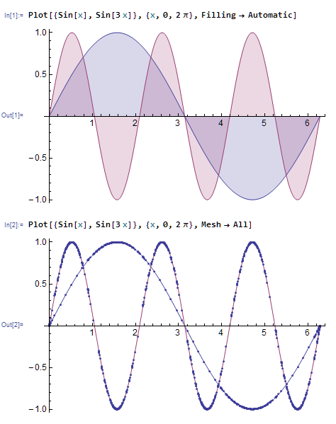
- 我喜欢用Mathematica画图,默认出图漂亮,自定义性好,支持常见各种类型的画图,能导出丰富的格式,动态交互和制作动画也很强大,还有一点:Mathematica很数学,语法和数学上的习惯更接近,函数或方程作图只需输入表达式和范围即可,Matlab和 Python中一般需要先手动离散化
- Matlab的可视化也很强大,不过被吐槽较多的一点是线条有锯齿(这个和取的点多少无关,其实也能消掉)(http://tieba.baidu.com/p/2087817806); display: inline-block; vertical-align: 0px; margin-left: 4px; background-position: 0px -204px; background-repeat: no-repeat no-repeat;">)3维绘图色调不好看,当然如果有耐心也可以画出漂亮的图形的
- Python的matplotlib库我也用过,风格是模仿Matlab的,就默认绘图来说比Matlab好看(起码没锯齿),好处楼上已经有人说过了,但是并非没有 缺点,使用matplotlib需要一点编程和Python基础,对于编程基础不好的同学来说入门会比其他的软件慢一点;matplotlib的2维绘图很好,但是3维绘图目前还比较差,各种绘图细节方面的可选项不算很丰富,不支持隐函数绘图(形如F(x,y,z)=0这种),性能也不好(如3D的scatter,大概1万个点就开始卡了,Mathematica和Matlab 10万个点都不算卡),3维的用mayavi这个库可能更好
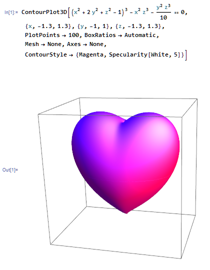
第二幅图中加上Mesh->All,显示出所有点的位置。可以看出Mathematica很聪明,它知道在变化剧烈的地方取更多的点,变化较少的地方少取一些
Mathematica不仅支持Latex,还能直接写二维的公式以及把公式导出为Latex
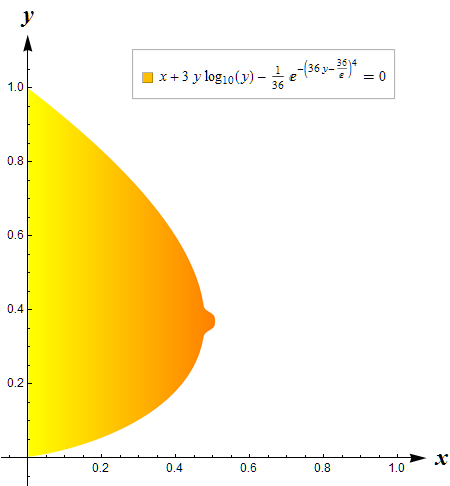

不等式区域绘图,在Mathematica中使用RegionPlot很简单,但在Matlab和Matplotlib中有点麻烦
(下面这个是在极坐标下的)

绘制图表下面是几个3D的,比较下Matlab和Python画的爱心
 下面是几个3D的,比较下Matlab和Python画的爱心
http://www.cnblogs.com/qtsharp/archive/2012/03/24/2415147.html); display: inline-block; vertical-align: 0px; margin-left: 4px; background-position: 0px -204px; background-repeat: no-repeat no-repeat;">
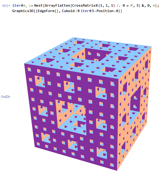
http://www.xue163.com/178/6/1787117.html); display: inline-block; vertical-align: 0px; margin-left: 4px; background-position: 0px -204px; background-repeat: no-repeat no-repeat;">2行代码创建的Menger sponge); display: inline-block; vertical-align: 0px; margin-left: 4px; background-position: 0px -204px; background-repeat: no-repeat no-repeat;">
 2行代码创建的
Matlab版:Matlab软件环境下的Sierpinsk地毯及Sierpinski海绵); display: inline-block; vertical-align: 0px; margin-left: 4px; background-position: 0px -204px; background-repeat: no-repeat no-repeat;">
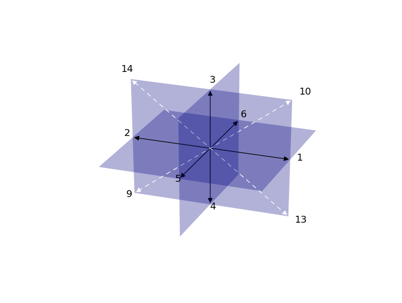
矢量场流线图图论中的图


 矢量场流线图
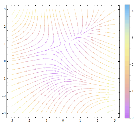 图论中的图
图论中的图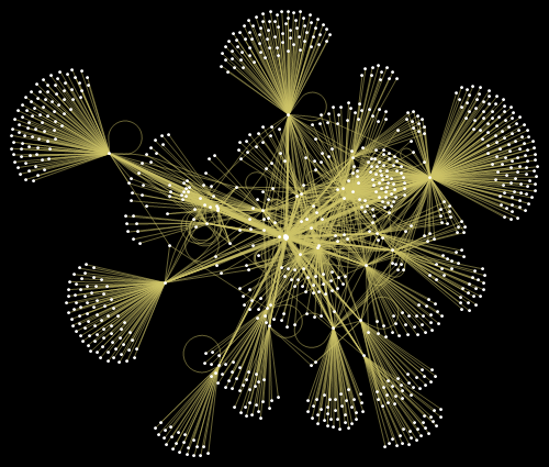
散点图
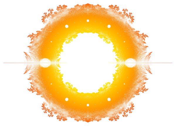
更多美图
http://www.51xuewen.com/group/513/topic_12635.htm); display: inline-block; vertical-align: 0px; margin-left: 4px; background-position: 0px -204px; background-repeat: no-repeat no-repeat;">
http://mathematica.stackexchange.com/questions/11880/animating-mathematica-se-logo); display: inline-block; vertical-align: 0px; margin-left: 4px; background-position: 0px -204px; background-repeat: no-repeat no-repeat;">
http://mathematica.stackexchange.com/questions/11350/xkcd-style-graphs
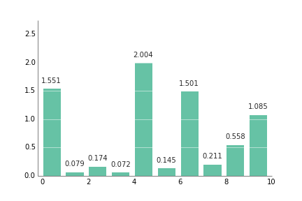
强烈推荐 Python 的绘图模块 matplotlib: python plotting); display: inline-block; vertical-align: 0px; margin-left: 4px; background-position: 0px -204px; background-repeat: no-repeat no-repeat;"> 。画出来的图真的是高端大气上档次,低调奢华有内涵~ 适用于从 2D 到 3D,从标量到矢量的各种绘图。能够保存成从 eps, pdf 到 svg, png, jpg 的多种格式。并且 Matplotlib 的绘图函数基本上都与 Matlab 的绘图函数名字都差不多,迁移的学习成本比较低。开源免费。如图所示(题目描述中的图在最后):
(以下图片均引用自 Thumbnail gallery); display: inline-block; vertical-align: 0px; margin-left: 4px; background-position: 0px -204px; background-repeat: no-repeat no-repeat;"> )
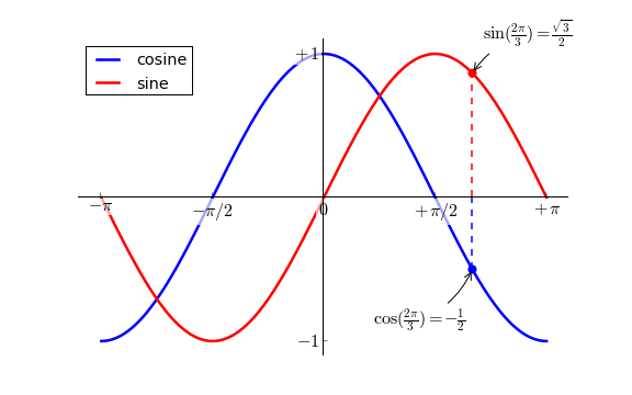
像这种普通的函数图象:
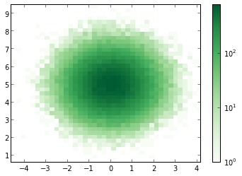
以及这种 Scatter 图(中文不知道该怎么说…):
精致的曲线,半透明的配色。都显出你那高贵冷艳的X格,最重要的是只需一行代码就能搞定。从此以后再也不用忍受 Matlab以及GNUPlot 中那蛋疼的配色了。
想画 3D 数据?没有问题 (不过用 mayavi 可能更方便一些):
四行代码你就能拥有(后三行是画坐标平面上的等高线,严格的额说还是一行)。
除此以外,不过你是矢量场,网络还是什么奇葩的需求都能够搞定:
这还没完,Matplotlib 还支持Latex公式的插入,当别人画的图还是这个样子的时候(以下图片引用自Matplotlib Tutorial(译)); display: inline-block; vertical-align: 0px; margin-left: 4px; background-position: 0px -204px; background-repeat: no-repeat no-repeat;">)
你能够把它变成这个样子:
如果再搭配上 IPython 作为运行终端(这张图是自己的~):
简直就是神器啊,有木有!
心动不如行动,还等什么?
(奉上教程一篇 Matplotlib Tutorial(译)); display: inline-block; vertical-align: 0px; margin-left: 4px; background-position: 0px -204px; background-repeat: no-repeat no-repeat;">)
==== Update: 2013-9-18 18:04 ====
经@许铖同学提醒,再补充一句,matplotlib 还可以话 xkcd 风格的图呦~
(图片引用自网络)
此外结合 IPython Notebook 后更多精彩内容,请看http://nbviewer.ipython.org/); display: inline-block; vertical-align: 0px; margin-left: 4px; background-position: 0px -204px; background-repeat: no-repeat no-repeat;">
==== Update: 2013-9-19 20:04 ====
如果嫌安装麻烦并且恰好在 Windows 系统下的话可以尝试Python的一个发行版winpython - Portable Scientific Python 2/3 32/64bit Distribution for Windows); display: inline-block; vertical-align: 0px; margin-left: 4px; background-position: 0px -204px; background-repeat: no-repeat no-repeat;">。
==== Update: 2013-10-1 23:45 ====
鉴于@van li同学质疑 matplotlib 是否能画出题目中所示的图像,我在这里将题目中的图像用 matplotlib 画出来如下:
代码在此处:https://gist.github.com/coldfog/c479124328fc6bb8b789); display: inline-block; vertical-align: 0px; margin-left: 4px; background-position: 0px -204px; background-repeat: no-repeat no-repeat;">
代码在此处:https://gist.github.com/coldfog/5da63a6958fc0a949b52); display: inline-block; vertical-align: 0px; margin-left: 4px; background-position: 0px -204px; background-repeat: no-repeat no-repeat;">
======== 2014.5.10更新======
看到楼下有人说配色和好看,唉....那我也贴几个吧...只不过当初限于篇幅没有写而已。
首先,python 有一个专门的配色包jiffyclub/brewer2mpl 路 GitHub); display: inline-block; vertical-align: 0px; margin-left: 4px; background-position: 0px -204px; background-repeat: no-repeat no-repeat;">,提供了从美术角度来讲的精美配色(戳这里感受ColorBrewer: Color Advice for Maps); display: inline-block; vertical-align: 0px; margin-left: 4px; background-position: 0px -204px; background-repeat: no-repeat no-repeat;">)。
此外还有一些致力于美化绘图的库,用起来也都非常方便,比如olgabot/prettyplotlib 路 GitHub); display: inline-block; vertical-align: 0px; margin-left: 4px; background-position: 0px -204px; background-repeat: no-repeat no-repeat;">。
废话不多说,上图就是王道。
(一下图片来源网络)
有人可能会说需要复杂的设置,其实也不用。比如上边这幅图,只需要多加一个参数就好:
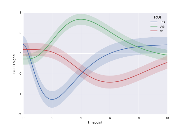
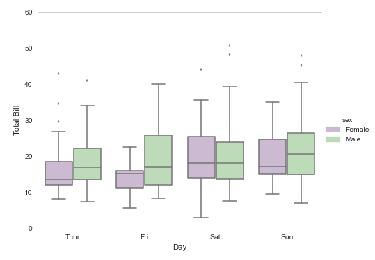
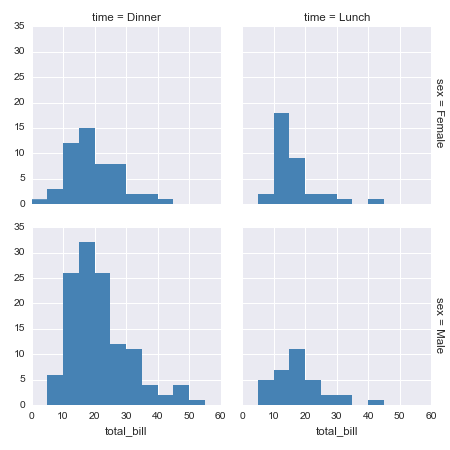
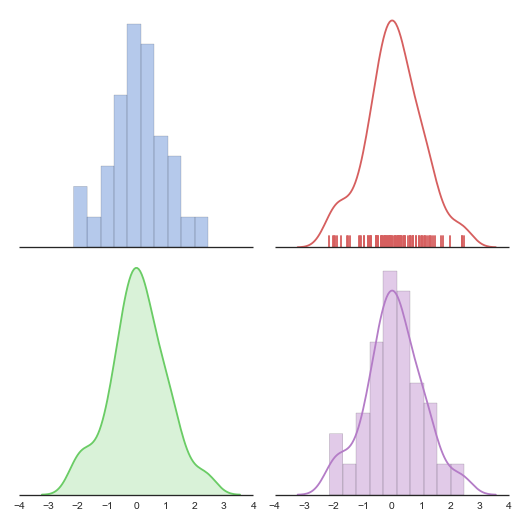
楼下说到统计绘图。嘛 seaborn (https://github.com/mwaskom/seaborn); display: inline-block; vertical-align: 0px; margin-left: 4px; background-position: 0px -204px; background-repeat: no-repeat no-repeat;">) 是一个调用 matplotlib 的统计绘图库,上图:
代码一行,后边的几乎都是一行,没做其他设置,默认就这样。我就不贴其他的代码了:
(以下图片均引用自 Thumbnail gallery); display: inline-block; vertical-align: 0px; margin-left: 4px; background-position: 0px -204px; background-repeat: no-repeat no-repeat;"> )
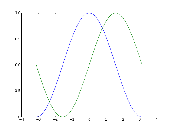
像这种普通的函数图象:
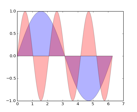
plt.fill(x, y1, 'b', x, y2, 'r', alpha=0.3) 以及这种 Scatter 图(中文不知道该怎么说…):
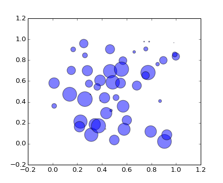
plt.scatter(x, y, s=area, alpha=0.5) 精致的曲线,半透明的配色。都显出你那高贵冷艳的X格,最重要的是只需一行代码就能搞定。从此以后再也不用忍受 Matlab以及GNUPlot 中那蛋疼的配色了。
想画 3D 数据?没有问题 (不过用 mayavi 可能更方便一些):
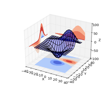
ax.plot_surface(X, Y, Z, rstride=8, cstride=8, alpha=0.3) cset = ax.contourf(X, Y, Z, zdir='z', offset=-100, cmap=cm.coolwarm) cset = ax.contourf(X, Y, Z, zdir='x', offset=-40, cmap=cm.coolwarm) cset = ax.contourf(X, Y, Z, zdir='y', offset=40, cmap=cm.coolwarm) 四行代码你就能拥有(后三行是画坐标平面上的等高线,严格的额说还是一行)。
除此以外,不过你是矢量场,网络还是什么奇葩的需求都能够搞定:
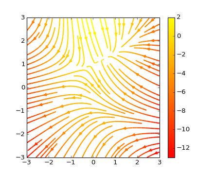
plt.streamplot(X, Y, U, V, color=U, linewidth=2, cmap=plt.cm.autumn) plt.colorbar() 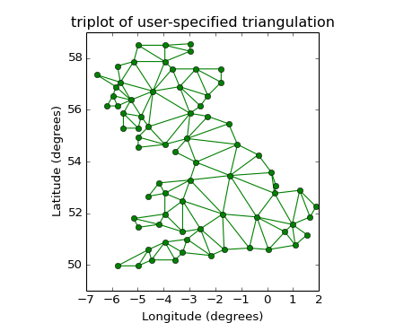
plt.triplot(x, y, triangles, 'go-') plt.title('triplot of user-specified triangulation') plt.xlabel('Longitude (degrees)') plt.ylabel('Latitude (degrees)') 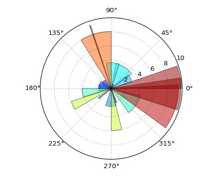
ax = plt.subplot(111, polar=True) bars = ax.bar(theta, radii, width=width, bottom=0.0) 这还没完,Matplotlib 还支持Latex公式的插入,当别人画的图还是这个样子的时候(以下图片引用自Matplotlib Tutorial(译)); display: inline-block; vertical-align: 0px; margin-left: 4px; background-position: 0px -204px; background-repeat: no-repeat no-repeat;">)
你能够把它变成这个样子:
 你能够把它变成这个样子:
如果再搭配上 IPython 作为运行终端(这张图是自己的~):
 如果再搭配上 IPython 作为运行终端(这张图是自己的~):
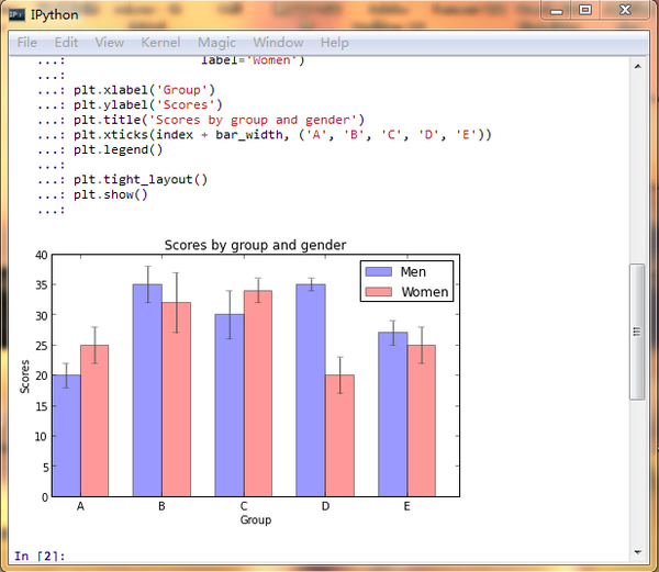
简直就是神器啊,有木有!
心动不如行动,还等什么?
(奉上教程一篇 Matplotlib Tutorial(译)); display: inline-block; vertical-align: 0px; margin-left: 4px; background-position: 0px -204px; background-repeat: no-repeat no-repeat;">)
==== Update: 2013-9-18 18:04 ====
经@许铖同学提醒,再补充一句,matplotlib 还可以话 xkcd 风格的图呦~
(图片引用自网络)
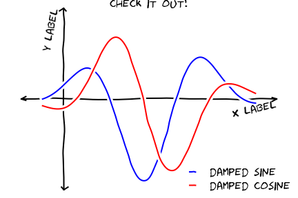 (图片引用自网络)
此外结合 IPython Notebook 后更多精彩内容,请看http://nbviewer.ipython.org/); display: inline-block; vertical-align: 0px; margin-left: 4px; background-position: 0px -204px; background-repeat: no-repeat no-repeat;">
==== Update: 2013-9-19 20:04 ====
如果嫌安装麻烦并且恰好在 Windows 系统下的话可以尝试Python的一个发行版winpython - Portable Scientific Python 2/3 32/64bit Distribution for Windows); display: inline-block; vertical-align: 0px; margin-left: 4px; background-position: 0px -204px; background-repeat: no-repeat no-repeat;">。
==== Update: 2013-10-1 23:45 ====
鉴于@van li同学质疑 matplotlib 是否能画出题目中所示的图像,我在这里将题目中的图像用 matplotlib 画出来如下:
代码在此处:https://gist.github.com/coldfog/c479124328fc6bb8b789); display: inline-block; vertical-align: 0px; margin-left: 4px; background-position: 0px -204px; background-repeat: no-repeat no-repeat;">
 代码在此处:
代码在此处:https://gist.github.com/coldfog/5da63a6958fc0a949b52); display: inline-block; vertical-align: 0px; margin-left: 4px; background-position: 0px -204px; background-repeat: no-repeat no-repeat;">
 代码在此处:
======== 2014.5.10更新======
看到楼下有人说配色和好看,唉....那我也贴几个吧...只不过当初限于篇幅没有写而已。
首先,python 有一个专门的配色包jiffyclub/brewer2mpl 路 GitHub); display: inline-block; vertical-align: 0px; margin-left: 4px; background-position: 0px -204px; background-repeat: no-repeat no-repeat;">,提供了从美术角度来讲的精美配色(戳这里感受ColorBrewer: Color Advice for Maps); display: inline-block; vertical-align: 0px; margin-left: 4px; background-position: 0px -204px; background-repeat: no-repeat no-repeat;">)。
此外还有一些致力于美化绘图的库,用起来也都非常方便,比如olgabot/prettyplotlib 路 GitHub); display: inline-block; vertical-align: 0px; margin-left: 4px; background-position: 0px -204px; background-repeat: no-repeat no-repeat;">。
废话不多说,上图就是王道。
(一下图片来源网络)

有人可能会说需要复杂的设置,其实也不用。比如上边这幅图,只需要多加一个参数就好:
cmap=brewer2mpl.get_map('RdBu', 'diverging', 8, reverse=True).mpl_colormap, 楼下说到统计绘图。嘛 seaborn (https://github.com/mwaskom/seaborn); display: inline-block; vertical-align: 0px; margin-left: 4px; background-position: 0px -204px; background-repeat: no-repeat no-repeat;">) 是一个调用 matplotlib 的统计绘图库,上图:
代码一行,后边的几乎都是一行,没做其他设置,默认就这样。我就不贴其他的代码了:
 代码一行,后边的几乎都是一行,没做其他设置,默认就这样。我就不贴其他的代码了:
g = sns.jointplot(x1, x2, kind="kde", size=7, space=0) 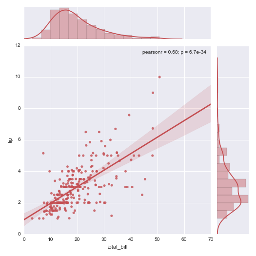
 提升卡
提升卡 置顶卡
置顶卡 沉默卡
沉默卡 变色卡
变色卡 抢沙发
抢沙发 千斤顶
千斤顶 显身卡
显身卡


 京公网安备 11010802022788号


